Whether you are thinking about a new website, a complex backbone system or a mobile app, user experience (UX) design is going to be one of the most important aspects of your product design. This is something most everybody agrees on yet we still see some really common misconceptions when it comes to actually creating UX.
Here are some quick tips to help you adapt the right mindset:
- Understand the needs of your target audience
- Don’t try to reinvent the wheel
- Keep it simple!
- Maintain consistency throughout the user journey
- Make different elements visually distinct
Understanding the needs of your target audience
This sounds fairly obvious and you would think it goes without saying but we have seen so many examples lately where this step was somewhat neglected that we felt it needs to be reiterated.
Intuition goes a long way especially if you are already operating in the given market segment but it can also quickly lead to false assumptions so you just can’t skip on collecting real life user input and feedback.
Take a step back and start with asking the following questions:
- Who are my target users? (For example: women, men, tech-savvy people, tech novices, young adults, etc.)
- What are my users’ needs? How can you address them?
- How can my user interface answer the users’ needs and deliver my value proposition at the same time?
Once you accept that you are not the user, you will understand how important it is to start with a thorough user research.
This research is done right if you can sample enough people, stay away from biasing their opinion and stay objective yourself. It is usually a good practice to use the same set of questions but leave some of them somewhat open ended to give an opportunity for new and potentially unexpected information to jump out. The 80/20 rule applies here, so eighty percent of the information you will hear will potentially be something you already know but the remaining twenty is where the magic happens and this is where you will learn the most.
Your learning doesn’t end here because after the user research is done and you have collected enough information to start designing you want to start prototyping and start user testing as early in the process as possible. I know that some of us stay away from these steps because they can be really time consuming and especially on a tight budget seem like a luxury but in fact these steps alone can make a potentially failing project into success.

Usability testing quickly teaches us some interesting facts:
- Our attention span is down from 12 seconds to 8 seconds. This means that you now have a shorter attention span than a Goldfish!
- Less visual information means text is more noticeable and raises the impact on the user.
- Recognition over recall goes a long way. Due to the limitations of human memory, designs showing users elements they can already easily recognize vastly improves usability.
Do not try to reinvent the wheel
Hopefully the last section helped us prepare for the next big item on the list: “don’t try to reinvent the wheel”. There is a reason why most websites and mobile apps are structured the way they are, it just works. Why? Because users are already used to it so they probably expect it to work that way. This is called the perpetuated habit. Your users don’t always like change, they are used to the “standard” and anything that is too different will just cause extra work for them.
Usually the intention is good, you try to differentiate your product from all the other competitors out there and you want to make it stand out. However, when this translates to confusing navigation patterns, odd color schemes, unorthodox layouts or strange fonts in the wrong places you hurt the most important thing in UX design, the user engagement.
Tried and tested layouts throughout a product make users instantly familiar with your platform and let them use it without getting annoyed by unfamiliar elements or feeling they have to start learning it from scratch. This actually allows you to stick to the patterns most of the time and put the most creative energy into areas where design innovation really matters like a unique landing page or an immersive onboarding experience.
Here are some quick links to some platform specific guidelines:
- UX best practices for apps on Google Play
- Material design guidelines
- Mac OS Human Interface Guidelines
It is always a good practice to start with a quick review of the platform developers’ recommendation.
Keep it simple!
To quote the Webflow blog: “Too much is an instant user experience turn-off.”
It is so true that we see the highest bounce rates on screens where users are facing with too much information, too many elements or confusing typography. This does not necessarily mean that the designers were not following the right patterns, it can simply mean that too much of the right patterns are applied on the same page.
There are some really interesting papers in the research of short term memory and cognitive psychology like Miller’s classic: “The Magical Number Seven, Plus or Minus Two: Some Limits on our Capacity for Processing Information” but practice shows that the most effective designs are even more limited and have only 1 to 3 main elements at maximum.
Your design is considered great when:
- Each page has a single and clear purpose. For example, your contact page is not diluted with cool facts about your team and your checkout page is restricted to only elements necessary for finishing the checkout process.
- You don’t need additional explanation as the pages and the elements on them are immediately understandable. Like a screen dedicated to search or video playback is something users should not need any additional help with.
- Any non-essential information is at the bottom of the page. We like to add direct links to our blog posts but such “you might also like” content is something you want to see when you are already done with reading the main topic of the page.
It is also easy to forget that there are two other aspects you have to always keep in mind, the design also has to be responsive and accessible.
Responsive simply means that it works on different screen sizes and devices and adjusts smoothly to various aspect ratios. To put this into perspective, there are 19 different iPhones currently supported and these are just the iOS devices so it is easy to imagine that simplicity goes a long way when trying to work equally well on all of them.
Accessible design allows users of all abilities to navigate, understand, and use a digital product successfully including people with low vision, blindness, hearing impairments, cognitive impairments, or motor impairments. Accessibility introduces a set of constraints but improving it also enhances usability for all users.
Maintain consistency throughout the user journey
I would like to bring up Elektron and their hardware instruments as an example here. They are known for their unique workflow that has a fairly steep learning curve and the sometimes confusing UI that some of their devices have. This comes from the fact that they offer really advanced functionality and their devices are often jam-packed with features but they have to achieve this within size, cost and manufacturing constraints.
So far, this might sound as an anti example but there is one thing they do better than almost anyone else and that is consistency within each and every device and consistency throughout their entire range. This allows musicians to learn the quirks of the devices and build up a second nature that allows them to perform with the devices freely even on the most difficult stages.
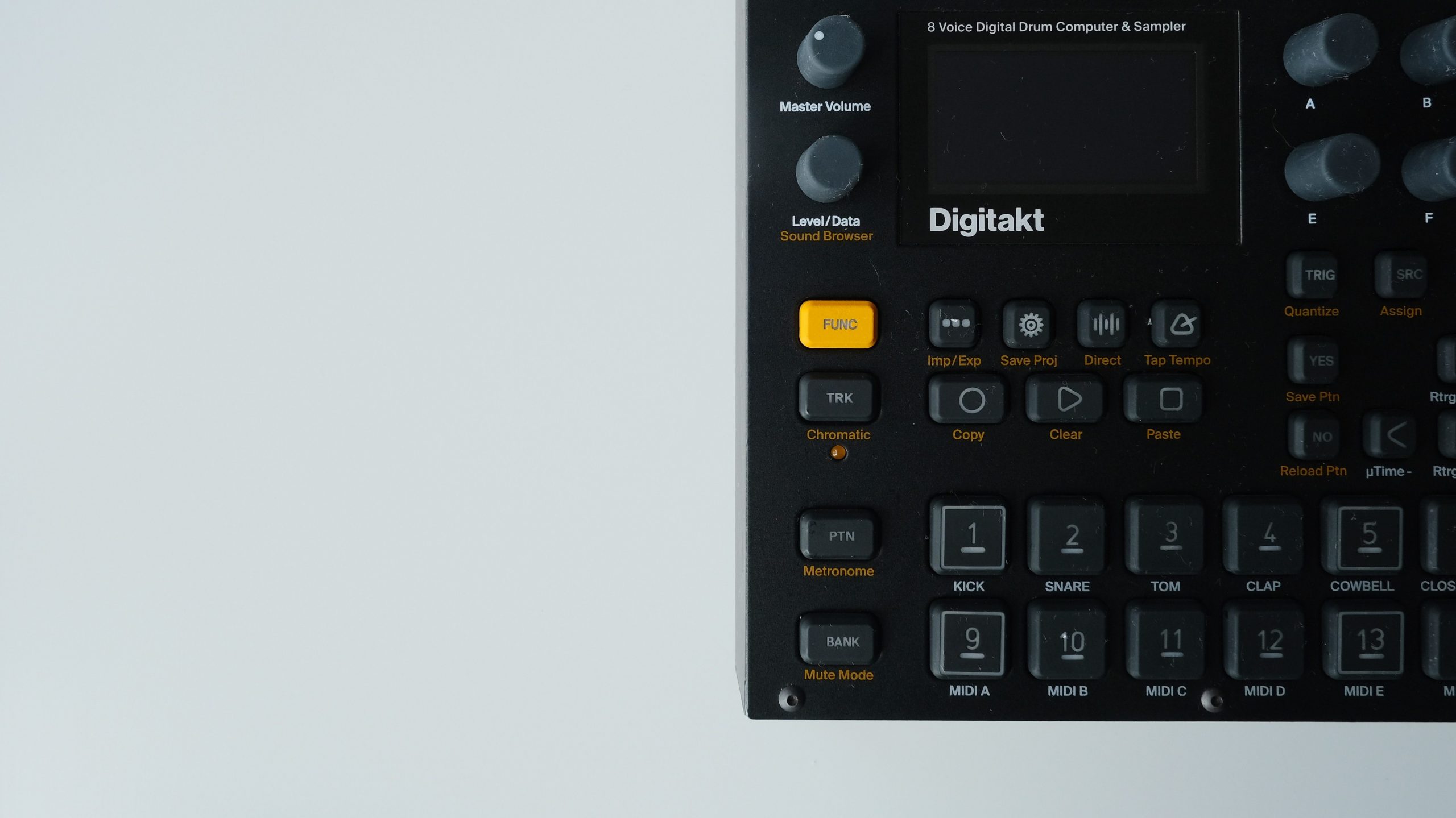
They show us two important things:
- UI and UX are different and separate topics and you can build a good UX even with a complex UI
- The user Flow is an extremely important aspect as you are trying to support your users getting from A to B and achieving their goal as frictionless as possible. Consistency allows you to build a smooth UX.
Here are some TIPs to keep in mind:
- You want to avoid so-called “dead-ends”, pages or places that lead nowhere. Ideally you want to create an ongoing journey in which there is always a next step ahead.
- Think about your users end goal, if they are there to find new and exciting content for example, build the experience and design the flow around that goal.
- Preventing errors might be better than fixing them. Errors and how they are handled have a huge impact on the user experience so eliminating error-prone situations or checking them and warning the user is a good practice.
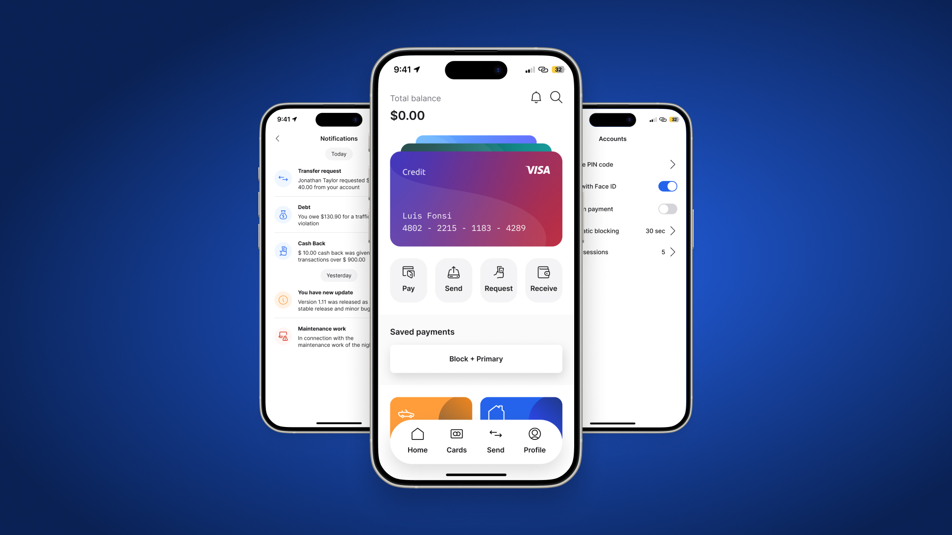
Make different elements visually distinct
Generally speaking, you want your users to have a quick glance at the display and understand the layout and what the elements are there for. You immediately assume that something went wrong if you click on an element that seems like a button but nothing happens as it is just a simple text with a different purpose.
- The most important element on the page needs to stand out the most.
To bring an easy example, the title of a blogpost is the biggest and first thing you face with when opening it. - Users always need to be aware of their location within the software.
Navigating easily to the home page for example has to be an easy option always available. - Action buttons need to stand out.
If you place a CTA (call-to-action) button in one of your ads, you want to draw attention to it and make people click so you usually highlight it with vivid colors. - The search field needs to be visually distinct with the word “search”.
People are used to this visualization and are looking for it, it is as simple as that. - Colors are important.
The background is usually muted, blue or underlined text is for links, red is for errors, high contrast areas stimulate action.. etc.
To sum it up really quickly, your goal is to build a flow in which your users don’t need to think about how to find or do something.
We love to talk about UX, in fact it is such an important part of our workflow when building new digital products that we could not avoid talking about it even if we intentionally decided to do so. If you have questions, ideas or just want to have a quick chat please do not hesitate to get in touch.